Four Sigmatic
Role: Creative Director
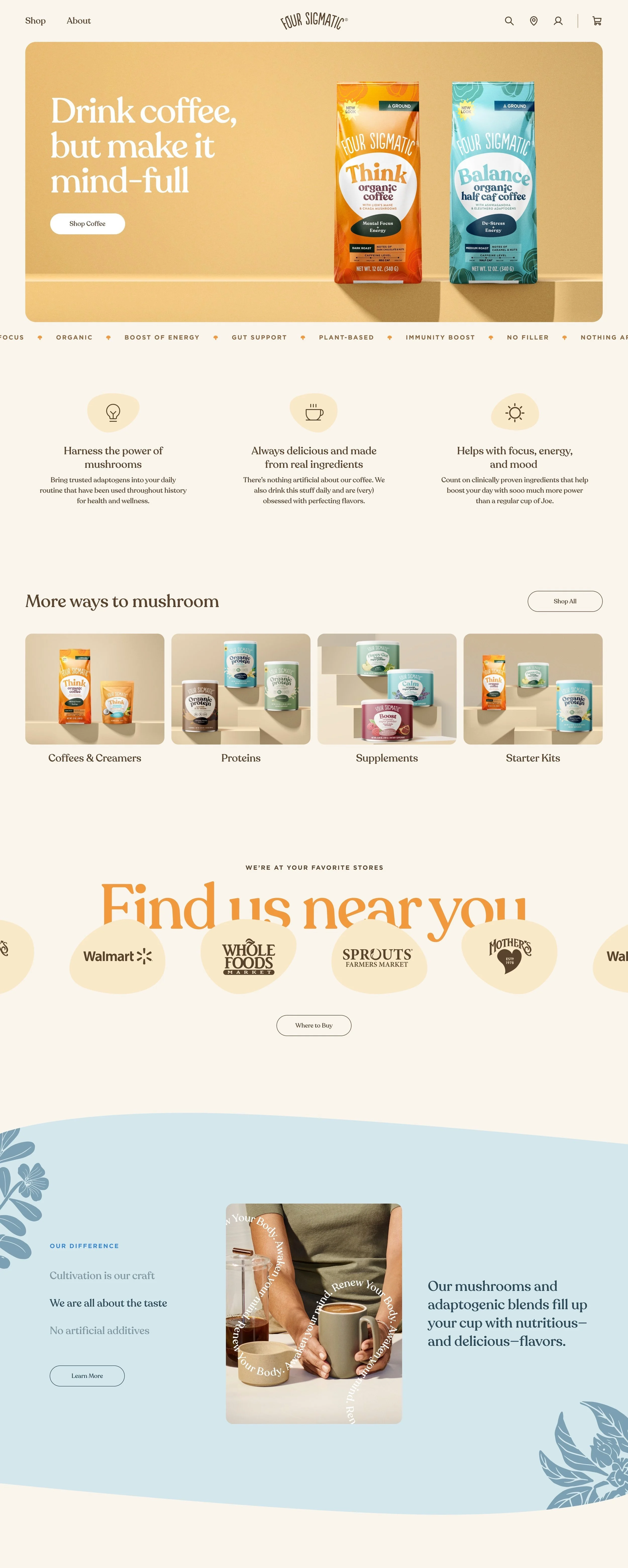
As Creative Director, I led the team in redesigning the Four Sigmatic website and brand guidelines to effectively communicate their product benefits and empower consumers with confidence. Through collaborative efforts, we revamped the website layout, refined brand messaging, and imagery, ensuring a user-friendly experience that conveyed transparency and authenticity. The result: a revitalized brand identity and digital platform that provided consumers with the knowledge they needed to understand Four Sigmatic's offerings.
Challenge:
With a newly established direction for the brand, Four Sigmatic was looking to redesign their website to better align with their positioning and create a cohesive brand from end to end. In addition they were looking for ways to educate the consumer on the importance of a mindful routine.
Approach:
The approach for the website was to create an extension of the packaging, utilizing the various colors, illustrations, and organic shapes throughout the site. This bridged the gap from the shelves around the world to the digital experience for the brand.
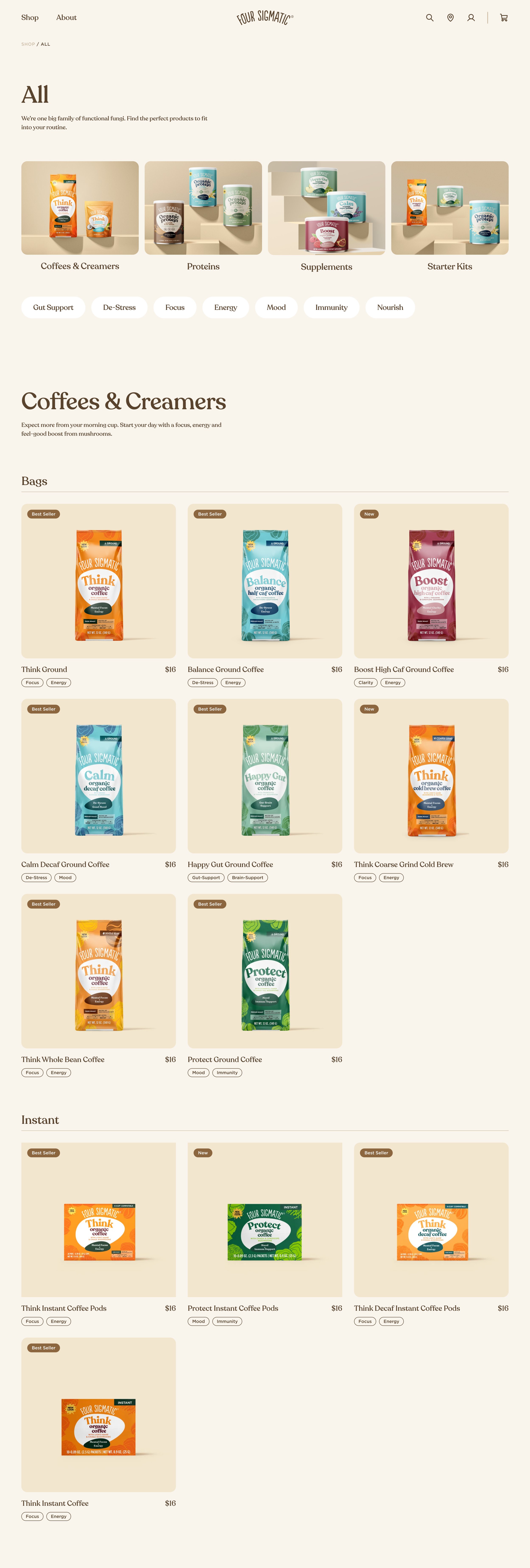
After some data analysis of the previous site the team noticed a huge opportunity to improve the overall navigation and product categorization of the site, this became the foundation for the teams as we continued the redesign.
A Mindful Wellness Routine
A Vibrant Experience
The new design system enabled us to maintain vibrant display of color and imagery throughout the site for both mobile and desktop.
Unique Challenges. Unique solutions.
Four Sigmatic had a unique challenge for their e-commerce site, requiring a minimum cart balance before a user can complete their purchase. to help with this we implemented a pack size quantity selector for all products along with a subscription discount to incentivize creating a mindful wellness routine.


